Alpha State
Brand Identity
This was an academic project, done at The Ohio State University’s Department of Design, but with a real client, the yoga and Pilates studio Alpha State in Columbus, OH.
Early concepts
The studio provides yoga and pilates as complementary activities. Initial concepts involved variations around the infinite symbol which is made out of two complementary forms.
Mark evolution
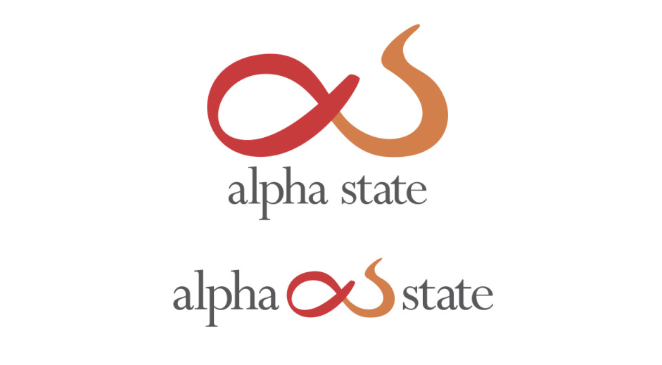
The mark evolved to use the initials of the studio’s name (alpha and s) as complementary forms.
Colors
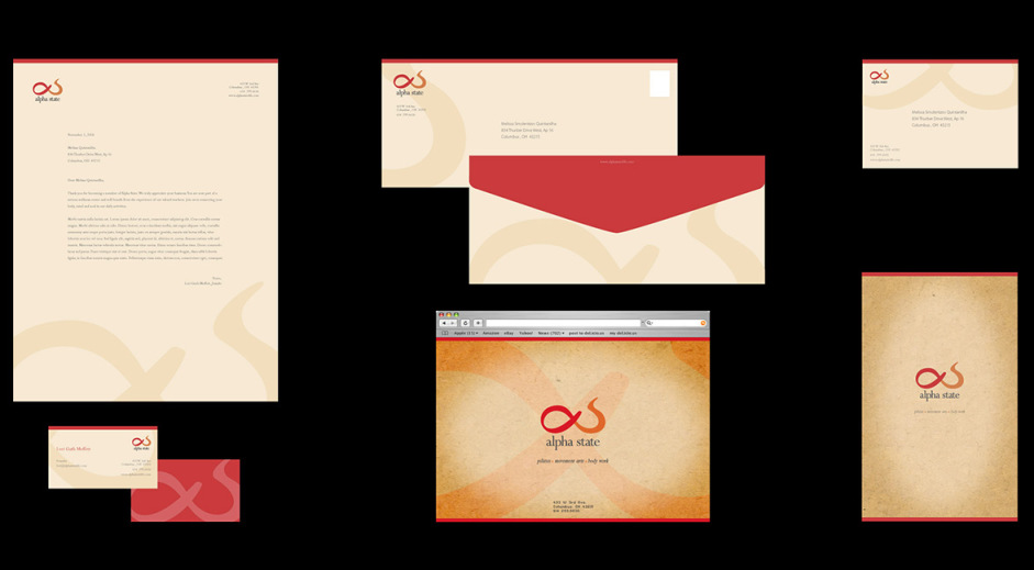
The colors chosen were warm and close in value. Each color is used for one of the complementary parts of the symbol. The vibrant colors stand out in the pastel backgrounds used in the visual identity.
Signatures
A final version of the mark with company name was developed in two versions: one horizontal and one vertical.
Typography
The type used was Perpetua Std because of its forms being similar to the ones used on the mark.
Audience testing
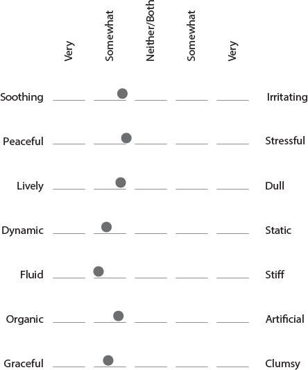
The symbol design was tested in black and white with 25 random people that were not from a design or artistic background. They were asked to rate the symbol according to seven adjectives and also describe what they thought it represented.
“It gives me the impression of something moving and growing at the same time. It also gives me a sensation of lightness.”
“It represents strength, balance but at the same time gives me the idea of tranquility.
It feels mutant and impermanent.”


